
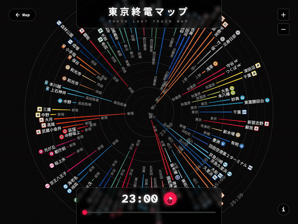
2018年に1枚の静止画として作った「東京終電マップ」を、8年越しでインタラクティブ版に進化させた作品。時間スライダーを動かすと、終電が終わった路線から消えていく「消えゆく花火」のような表現で、深夜の東京から帰宅できる範囲が時間とともに狭まっていく様子を体験できる。18事業者分の終電データを、公共交通オープンデータセンターと各社公式サイトから統合して作成。AIとの協働で、構想はあったもののコーディングできずにいた作品をようやく形にした。Xで2万いいね超の反響があり、公共交通オープンデータチャレンジ2025で審査員特別賞を受賞。詳しい解説はnoteに掲載。
An interactive evolution of the "Tokyo Last Train Map," originally created as a static image in 2018 — brought to life eight years later. As you move the time slider, train lines disappear one by one as their last trains finish running, like fireworks fading in the night sky. Last train data from 18 railway operators was integrated, combining open data from the Public Transportation Open Data Center with manually collected information from each company's website. Built through AI-assisted coding, this project finally realized a vision that had existed since the original work but couldn't be implemented due to a lack of programming skills. Received over 20,000 likes on X and won the Jury Special Award at the Public Transportation Open Data Challenge 2025. Detailed write-up available on note.