

アドビ風の元素周期表 / Adobe-style periodic table 2018, 2020
2018年5月, 2020年6月
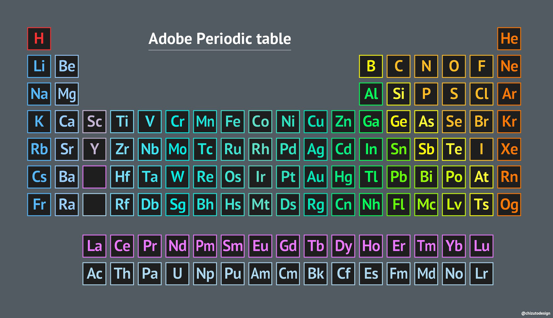
Adobe Creative Cloudのアプリアイコンと元素記号の見た目が似ていることに気づき、元素周期表をそのままAdobeのデザインに置き換えた作品。配置は本物の元素周期表に準拠している。
デザイナーにとって最も身近なツールであるAdobe製品を題材にしたこともあり、Twitterで当時7万いいねと大きな反響があった。地図ではないが、「見慣れたフォーマットに別の要素を入れる」という発想の原点のような作品。
A periodic table reimagined with Adobe Creative Cloud apps. The idea came from noticing that Adobe's app icons — two-letter abbreviations in colored squares — look remarkably similar to chemical element symbols. The layout follows the actual periodic table exactly, with Adobe apps placed in corresponding positions. As a piece familiar to all designers, it received approximately 70,000 likes on Twitter.